Safe Solutions
Safe Solutions is a digital transformation company founded in 2017 and based in Egypt, serving clients across Egypt, KSA, and the Gulf region. The company specializes in Information Security, Data Protection, and Process Automation, helping businesses safeguard their critical assets, optimize operations, and achieve sustainable growth. For over seven years, Safe Solutions has built a reputation as a trusted technology partner, delivering secure, scalable, and innovative IT solutions supported by a team of certified experts and exclusive global partnerships. To visually capture this mission, this project focused on creating a modern logo that combines security and technology in a clean, professional design.
Logo Objectives:
- Create a modern, professional visual identity suitable for a digital transformation and information security company.
- Incorporate a shield symbol to represent protection, safety, and reliability.
- Integrate a geometric "S" monogram with circuit-like paths to symbolize digital transformation, IT infrastructure, and connectivity.
- Use a blue gradient color palette that conveys trust, professionalism, and technological strength.
- Ensure the logo remains legible and scalable across digital platforms, corporate documents, signage, and marketing materials.
Creative Process:
The creative process for Safe Solutions began with a clear understanding of the company’s dual focus: security and digital transformation. Founded in 2017 and serving clients across Egypt, KSA, and the Gulf, Safe Solutions has built a reputation as a trusted technology partner in Information Security, Data Protection, and Process Automation. The design team recognized that the logo needed to communicate both protection (security) and innovation (technology) in a single, cohesive mark.
Early explorations focused on two core symbols: the shield (representing protection, safety, and reliability) and circuit paths (representing technology, connectivity, and IT infrastructure). The challenge was to blend these elements seamlessly without creating a design that felt cluttered or overly complex. Multiple concepts were sketched, exploring various shield shapes, monogram placements, and circuit patterns.
The selected direction evolved around a shield containing a geometric “S” monogram. The “S” was designed with circuit-like paths and angular lines, creating a visual connection to digital transformation, networks, and IT systems. This approach ensures that the logo immediately communicates the company’s core services at a glance. The shield provides a sense of trust and protection, while the circuit-inspired “S” adds a modern, tech-forward edge.
Typography was carefully chosen to complement this mark—a bold, clean sans-serif typeface for the brand name “Safe Solutions,” emphasizing clarity and confidence. The color palette focused on a blue gradient, a color universally associated with trust, professionalism, and technological strength. Secondary colors were selected to provide flexibility across various applications. Throughout the process, the team ensured that every element of the logo reinforced the brand’s core message: providing secure, innovative, and integrated digital services that ensure protection without compromising performance.
Final Logo Design:
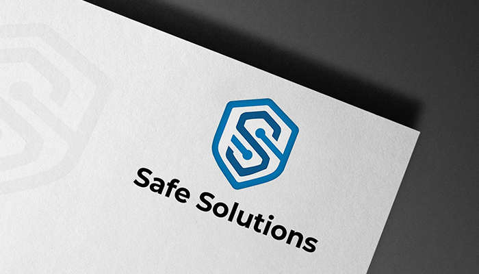
The final logo for Safe Solutions presents a modern, professional identity that masterfully combines security and technology in a clean, memorable design. The primary logo features a distinctive shield shape as its central visual element. This shield represents protection, safety, and reliability—core values for a company specializing in Information Security and Data Protection. The shield’s contours are clean and geometric, avoiding overly ornate details to maintain a contemporary, tech-forward appearance.
Inside the shield, a geometric “S” monogram is crafted with circuit-like paths and angular lines. This “S” is not a simple letterform but rather a symbol of digital transformation, IT infrastructure, and connectivity. The circuit-inspired design evokes images of computer boards, networks, and data flows, immediately communicating the company’s expertise in technology and automation. The combination of the protective shield with the technological “S” creates a powerful visual statement: security and innovation working together.
Alongside or beneath the shield mark, the brand name “Safe Solutions” appears in a bold, clean sans-serif typeface. The typography is strong and confident, emphasizing clarity and professionalism. The black or dark tone of the text provides excellent contrast against the blue shield, ensuring legibility across all applications.
The color palette is anchored by a professional blue gradient. The primary blue (HEX: 0282C4, RGB: 2,130,196, CMYK: 83% Cyan, 40% Magenta, 1% Yellow, 0% Black) conveys trust, professionalism, and technological strength. A deeper blue (HEX: 0A5E93) adds depth and dimension to the gradient, while black (HEX: 000000) is used for the wordmark to emphasize clarity and confidence. Secondary colors including light gray (HEX: A6A6A6), off-white (HEX: F2F2F2), dark navy (HEX: 06385F), and a lighter blue accent (HEX: 6FBFF0) provide flexibility for various applications and backgrounds.
The overall composition is balanced, authoritative, and highly memorable. The shield with its circuit-like “S” communicates at a glance that Safe Solutions provides secure, innovative, and integrated digital services—ensuring protection without compromising performance. This logo serves the company well across all touchpoints, from corporate presentations and security audit reports to website headers and client proposals.
Logo Variations:
- Full Color Version: Primary logo featuring the blue gradient shield with circuit "S" and black wordmark for use on light backgrounds.
- Reverse (Light) Version: White version of the complete logo for application on dark or colored backgrounds such as website headers or corporate banners.
- Monochrome Version: Single-color dark blue or black rendition suitable for one-color printing, legal documents, or faxes.
- Icon Only: Standalone shield with circuit "S" monogram for use as a favicon, mobile app icon, social media profile image, or small-scale applications.
- Horizontal Layout: Full logo with shield icon placed to the left of the wordmark for standard usage across most corporate applications.
- Stacked Vertical Layout: Shield icon centered above the wordmark for square applications such as business cards, document watermarks, or signage.
More from this Collaboration


Start Your Journey Today!
If you need help getting started with a campaign that’s tailored to meet the needs of your company.

