Menu
Close
- Services
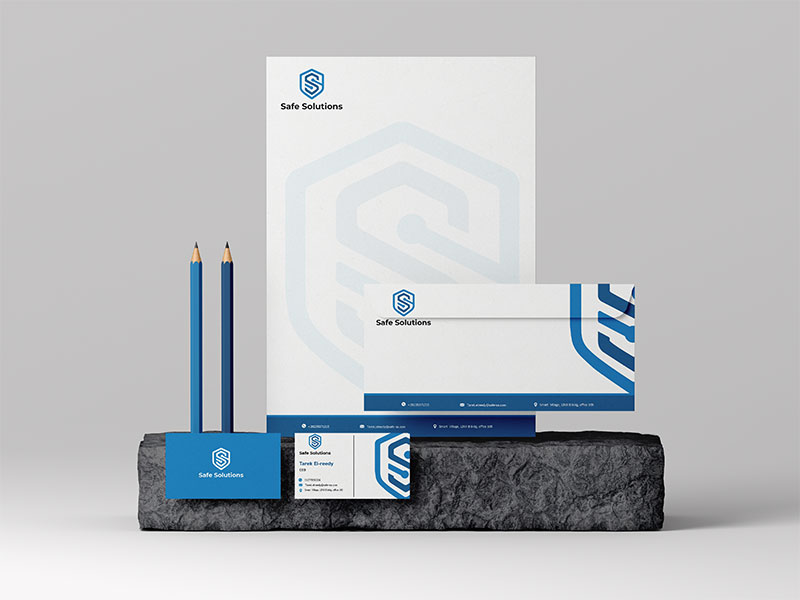
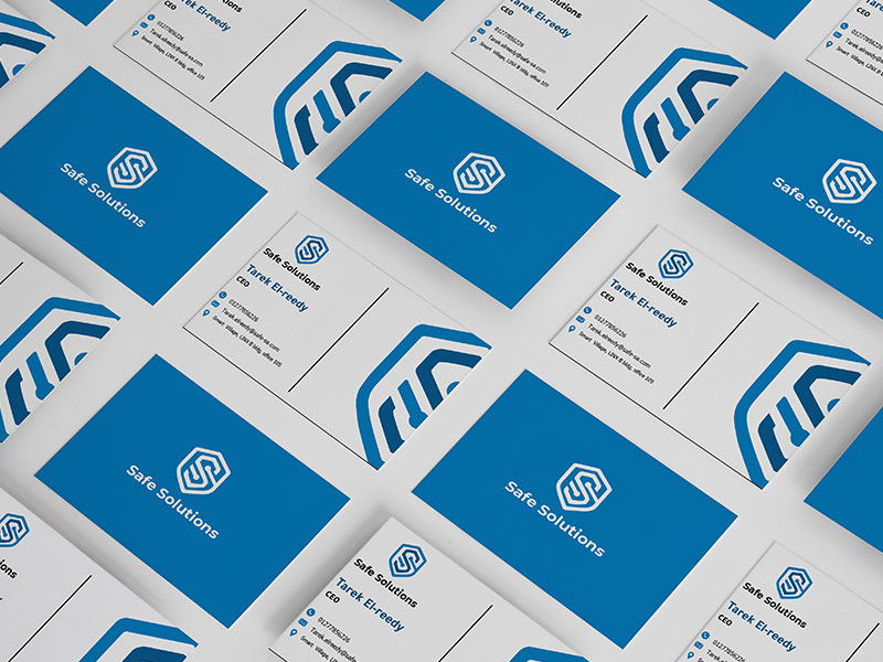
Give your business a unique look to stand out from the crowd.
Create a visual language that represents your brand.
Grow your business with our Eye-Catching and Professional Graphic Design Services.
Expert Web Design & Development Services That Will Take Your Business to the Next Level.
Grow your business online. We design and develop eCommerce websites that convert visitors into paying customers.
Keeping Your Website Up to Date, Enhancing Performance, and Ensuring Security for Your Online Success.
SEO Services to Boost Your Online Visibility.
Get Noticed, Get Leads, Get Results.
Increase Traffic and Create Better Customer Engagement.
Grow your business with a digital marketing strategy that works!
Connects the right customers to the right products at the right time, and always at the right price.
We convert your knowledge into captivating content that tells your story and appeals to your target audience.
Give your business a unique look to stand out from the crowd.
Create a visual language that represents your brand.
Grow your business with our Eye-Catching Graphic Design Services.
Expert Web Design & Development Services That Will Take Your Business to the Next Level.
Grow your business online. We design and develop eCommerce websites that convert visitors into paying customers.
Keeping Your Website Up to Date, Enhancing Performance, and Ensuring Security for Your Online Success.
Grow your business with a digital marketing strategy that works!
Connects the right customers to the right products at the right time and price.
Lorem Ipsum is simply dummy text of the printing industry.
SEO Services to Boost Your Online Visibility.
Our digital advertising solutions help you to achieve your goals.
Increase Traffic and Create Better Customer Engagement.
We convert your knowledge into captivating content.
Lorem Ipsum is simply dummy text of the printing industry.
Lorem Ipsum is simply dummy text of the printing industry.
- Industries
- Markets
- Portfolio
- Pricing
- Resources
- About Us
- Contact Us
- Services
Give your business a unique look to stand out from the crowd.
Create a visual language that represents your brand.
Grow your business with our Eye-Catching and Professional Graphic Design Services.
Expert Web Design & Development Services That Will Take Your Business to the Next Level.
Grow your business online. We design and develop eCommerce websites that convert visitors into paying customers.
Keeping Your Website Up to Date, Enhancing Performance, and Ensuring Security for Your Online Success.
SEO Services to Boost Your Online Visibility.
Get Noticed, Get Leads, Get Results.
Increase Traffic and Create Better Customer Engagement.
Grow your business with a digital marketing strategy that works!
Connects the right customers to the right products at the right time, and always at the right price.
We convert your knowledge into captivating content that tells your story and appeals to your target audience.
Give your business a unique look to stand out from the crowd.
Create a visual language that represents your brand.
Grow your business with our Eye-Catching Graphic Design Services.
Expert Web Design & Development Services That Will Take Your Business to the Next Level.
Grow your business online. We design and develop eCommerce websites that convert visitors into paying customers.
Keeping Your Website Up to Date, Enhancing Performance, and Ensuring Security for Your Online Success.
Grow your business with a digital marketing strategy that works!
Connects the right customers to the right products at the right time and price.
Lorem Ipsum is simply dummy text of the printing industry.
SEO Services to Boost Your Online Visibility.
Our digital advertising solutions help you to achieve your goals.
Increase Traffic and Create Better Customer Engagement.
We convert your knowledge into captivating content.
Lorem Ipsum is simply dummy text of the printing industry.
Lorem Ipsum is simply dummy text of the printing industry.
- Industries
- Markets
- Portfolio
- Pricing
- Resources
- About Us
- Contact Us