
Green Pen
Green Pen is a trusted partner in academic, medical, and technical writing, operating on the belief that every word matters. The company provides an advanced writing service that combines professional expertise with cutting-edge artificial intelligence tools, offering exceptional support for researchers, students, and professionals. Services include medical writing, review, translation, and innovative solutions that leverage both human and artificial intelligence. Green Pen transforms complex research, data, and reports into polished, professional, and impactful content, handling intricate details so clients can focus on their expertise and breakthroughs. To visually capture this mission, this project focused on creating a fresh, memorable logo that combines the concept of a pen with the brand name “Green Pen,” symbolizing mastery, commitment, and outstanding service.
Logo Objectives:
- Create a fresh, professional visual identity suitable for academic, medical, and technical writing services.
- Incorporate a pen symbol as a clear visual representation of the company's core service (writing).
- Use a green color palette that evokes growth, clarity, trust, and environmental consciousness.
- Ensure the logo remains legible and scalable across digital platforms, documents, stationery, and marketing materials.
- Develop a clean, modern design that appeals to researchers, students, and professionals.
Creative Process:
The creative process for Green Pen began with the brand’s powerful tagline: “Where Every Word Matters!” This message, combined with the thoughtfully chosen name “Green Pen Proof,” guided every design decision. The name itself is both appropriate and expressive of the company’s specialization in proofreading and writing services. The design team recognized that the logo needed to communicate professionalism, precision, and trust while also feeling approachable and modern.
Early explorations focused on two primary elements: the pen (as a symbol of writing, precision, and craftsmanship) and the color green (as a symbol of growth, clarity, freshness, and environmental awareness). The team explored various pen illustrations—from classic fountain pens to modern stylus shapes—and various ways to integrate these with typographic treatments of the brand name.
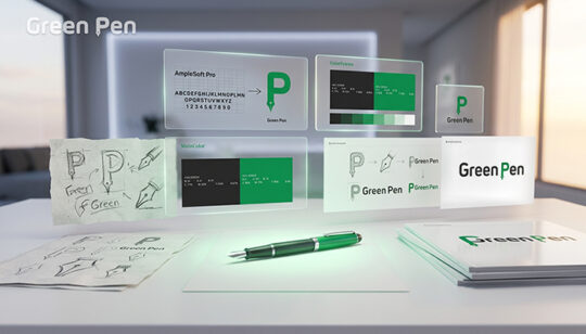
Multiple concepts were sketched and refined, balancing simplicity with visual impact. The selected direction evolved around a clean, stylized pen icon combined harmoniously with the wordmark “Green Pen.” The pen element was designed to be sleek and contemporary, avoiding overly ornate or dated styles. This choice reflects the company’s unique approach of combining professional human expertise with advanced AI tools—a blend of traditional craftsmanship and modern technology.
Typography was carefully chosen to complement the pen icon—a clean, modern sans-serif typeface that feels professional yet approachable. The color palette focused on a fresh, vibrant green (HEX: 05934C) paired with a sophisticated dark gray or black (HEX: 292929) for contrast and readability. This combination creates a brand identity that feels trustworthy, energetic, and distinctly modern. Throughout the process, the team ensured that the combination of the pen icon and wordmark would be visually striking and memorable, effectively communicating the company’s brand identity and symbolizing mastery and commitment to outstanding service.
Final Logo Design:
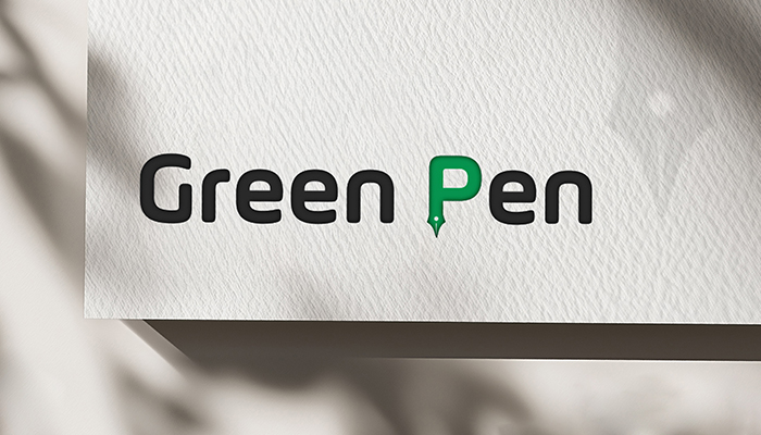
The final logo for Green Pen presents a fresh, professional identity that beautifully combines symbolic and typographic elements. The primary logo features two integrated components: a stylized pen icon and the wordmark “Green Pen.” The pen icon is sleek, modern, and minimalist—typically depicted as a clean, angled line with a pointed tip that suggests precision, writing, and attention to detail. The pen may be oriented diagonally, creating a sense of forward movement, progress, and the act of writing itself.
The wordmark “Green Pen” is rendered in a clean, contemporary sans-serif typeface. The letterforms are well-spaced and highly legible, with a modern character that appeals to academics, researchers, and professionals. The word “Green” may be given subtle emphasis through color, while “Pen” complements it in perfect harmony. The overall composition is balanced and uncluttered, allowing the brand name and symbol to work together seamlessly.
The color palette is anchored by a vibrant, fresh green with the HEX code #05934C (RGB: 5, 147, 76; CMYK: 86% Cyan, 17% Magenta, 96% Yellow, 4% Black). This particular shade of green evokes growth, clarity, trust, environmental consciousness, and the “green” in the brand name—suggesting fresh ideas, ethical practices, and sustainable excellence. This green is paired with a sophisticated dark gray or black (HEX: #292929; RGB: 41, 41, 41; CMYK: 71% Cyan, 65% Magenta, 64% Yellow, 67% Black) for the wordmark or supporting elements, providing strong contrast and professional stability.
The combination of the pen icon and the wordmark within the logo symbolizes mastery and commitment to providing outstanding service. The pen represents the craft of writing and the meticulous attention to every word, while the green color represents growth, clarity, and the fresh perspective the company brings to every project. Together, these elements create a visually striking, memorable logo that fully aligns with the company’s vision, goals, and values—reflecting a flexible, continuous service that transforms complex work into polished, impactful content.
Logo Variations:
- Full Color Version: Primary logo featuring the vibrant green pen icon and dark gray/black wordmark for use on light backgrounds.
- Reverse (Light) Version: White version of the complete logo for application on dark or colored backgrounds such as document covers or website headers.
- Monochrome Version: Single-color dark gray or black rendition suitable for one-color printing, academic documents, or faxes.
- Icon Only: Standalone pen icon for use as a favicon, mobile app icon, social media profile image, or small-scale applications such as document watermarks.
- Horizontal Layout: Full logo with pen icon placed to the left of the wordmark for standard usage across most applications.
- Stacked Vertical Layout: Pen icon centered above the wordmark for square applications such as website headers, business cards, or document title pages.
Start Your Journey Today!
If you need help getting started with a campaign that’s tailored to meet the needs of your company.

