Wesam Medical Holding
Wesam Medical Holding is a healthcare investment company founded in 2023, headquartered in Riyadh, and affiliated with Al-Dahyan Real Estate Group. The company aims to identify and invest in distinctive and attractive investment opportunities within the health sector, both inside and outside the Kingdom of Saudi Arabia, with a strong focus on local opportunities. In light of the transformative vision the Kingdom is witnessing, the company seeks to bring about positive change in the healthcare sector by building a balanced and diversified portfolio across various medical service sectors. Wesam Medical Holding focuses on opportunities with medium to long-term positive returns, ensuring profitability for shareholders while helping partners grow. To establish a credible and professional brand presence, this project focused on creating a logo that reflects trust, medical excellence, and strategic vision.
Logo Objectives:
- Create a professional, trustworthy visual identity suitable for a healthcare investment holding company.
- Incorporate medical or healthcare-related symbolism that conveys care, healing, and professionalism.
- Ensure the logo respects both Arabic and English brand name presentations, as shown in the bilingual identity.
- Use a color palette that evokes trust, cleanliness, and stability—essential qualities in the healthcare investment sector.
- Provide versatile logo variations suitable for corporate applications including letterheads, presentations, signage, and digital platforms.
Creative Process:
The creative process for Wesam Medical Holding began with a deep understanding of the company’s mission and positioning. Founded in 2023 in Riyadh, the company operates at the intersection of healthcare and investment, backed by the reputable Al-Dahyan Real Estate Group. This dual identity—medical compassion combined with investment rigor—guided every design decision.
The design team started by researching visual languages commonly associated with healthcare: crosses, crescents, shields, snakes (caduceus), hearts, and abstract medical symbols. However, the goal was to avoid clichés while still communicating medical trust. The team also considered geometric shapes that represent growth, stability, and forward-looking vision—key attributes for an investment holding company focused on the Kingdom’s transformative healthcare sector.
Multiple concepts were sketched and refined, balancing the Arabic script “وسام الطبية القابضة” with the English “Wesam Medical Holding.” The selected direction evolved around a shield-like or emblematic mark that combines medical symbolism with a sense of protection and reliability. The mark was designed to be equally meaningful in both cultural contexts, respecting the Saudi heritage while presenting a modern, international face. Typography for the English version was chosen to be clean, professional, and authoritative—a serif or semi-serif font that conveys tradition and trust. The Arabic calligraphy was carefully crafted to complement the English mark, creating a cohesive bilingual identity. Color exploration focused on deep, calming blues and teals associated with healthcare, combined with crisp whites or subtle metallic accents that suggest premium quality and strategic vision.
Final Logo Design:
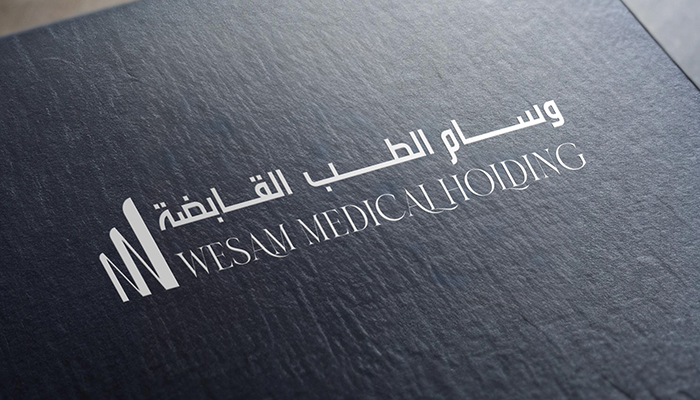
The final logo for Wesam Medical Holding presents a professional, trustworthy identity that beautifully balances medical symbolism with corporate authority. The primary logo features a distinctive emblematic mark—likely a stylized shield, cross, or interlocking geometric form—that conveys protection, care, and medical excellence. This mark serves as the visual anchor of the brand, evoking the company’s commitment to positive change in the healthcare sector.
Alongside or beneath the emblem, the English brand name “Wesam Medical Holding” appears in a clean, sophisticated serif or semi-serif typeface. The typography is carefully kerned and scaled to convey stability, tradition, and trustworthiness—essential qualities for an investment company that manages shareholder capital while impacting patient care. The word “Holding” is often presented in a slightly lighter weight or smaller size, establishing a clear hierarchy that emphasizes the primary brand name “Wesam Medical.”
The Arabic version, “وسام الطبية القابضة,” is rendered in an elegant, professional calligraphic style that respects the cultural heritage of Saudi Arabia while maintaining excellent legibility. The Arabic text is balanced harmoniously with the English version, allowing the logo to function seamlessly in bilingual applications.
The color palette features deep, calming shades of blue or teal—colors universally associated with healthcare, trust, stability, and professionalism. These colors are often paired with crisp white or subtle silver accents that suggest clarity, precision, and strategic vision. The overall composition is balanced, authoritative, and highly memorable, ensuring strong brand recognition across corporate applications such as investment proposals, annual reports, signage, digital platforms, and official documentation.
Logo Variations:
- Full Color Version: Primary logo featuring the emblematic mark and bilingual text in healthcare-appropriate blues/teals for use on light backgrounds.
- Reverse (Light) Version: White version of the complete logo for application on dark or colored backgrounds such as corporate presentations or banners.
- Monochrome Version: Single-color dark blue, navy, or black rendition suitable for one-color printing, legal documents, or faxes.
- Icon Only: Standalone emblematic mark for use as a favicon, mobile app icon, or small-scale applications such as social media profiles.
- Horizontal Layout: Full logo with emblem placed to the left of the bilingual or English-only text for standard corporate usage.
- Stacked Vertical Layout: Emblem centered above the bilingual text for square applications such as building signage or document watermarks.
Start Your Journey Today!
If you need help getting started with a campaign that’s tailored to meet the needs of your company.

