G-Horizon Aluminum
G-Horizon Aluminum is dedicated to pioneering sustainable aluminum solutions for a greener future. With a commitment to environmental responsibility and innovation, the company focuses on producing aluminum products that minimize ecological impact while maintaining the highest standards of quality and performance. To establish a brand presence that reflects this mission, this project focused on creating a modern, forward-thinking logo that communicates sustainability, innovation, and a horizon-focused vision for the future.
Logo Objectives:
- Create a modern, environmentally conscious visual identity suitable for the sustainable aluminum industry.
- Incorporate visual elements that evoke sustainability, forward momentum, and a "horizon" perspective.
- Use a color palette that reflects nature, growth, and environmental responsibility.
- Ensure the logo remains legible and scalable across product packaging, digital platforms, signage, and corporate communications.
- Develop versatile logo variations suitable for various applications including monochrome printing.
Creative Process:
The creative process for G-Horizon Aluminum began with the brand’s powerful tagline: “Pioneering Sustainable Aluminum for a Greener Future.” This message became the guiding light for all design decisions. The team recognized that the aluminum industry is often associated with heavy industry and environmental challenges, so the logo needed to shift that perception toward sustainability, innovation, and hope.
Early explorations focused on dual symbolism—combining elements that represent aluminum (such as sleek metallic lines, geometric shapes, or industrial angles) with elements that represent sustainability and the horizon (such as rising suns, curved landscapes, leaves, or circular economy symbols). The goal was to create a mark that feels both technologically advanced and environmentally friendly.
Multiple concepts were sketched and refined, balancing industrial precision with organic warmth. The selected direction evolved around a stylized “G” monogram that incorporates a horizon line and perhaps a leaf or sun element. This mark was designed to feel dynamic and forward-moving—like a sunrise over a clean, green future. The horizon element directly references the brand name while symbolizing vision, opportunity, and the future of sustainable industry.
Typography was carefully chosen to complement this modern mark—a clean, geometric sans-serif typeface for “G-Horizon” that feels contemporary and precise, paired with a simpler treatment for “Aluminum” that grounds the brand in its industry. Color exploration focused on fresh greens (representing sustainability and nature) combined with sleek silvers or grays (representing aluminum and industrial quality). The design team also explored blue tones that evoke sky, horizon, and clean technology. Throughout the process, particular attention was paid to creating a logo that would look equally compelling on aluminum product packaging, digital platforms, and industrial signage.
Final Logo Design:
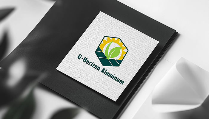
The final logo for G-Horizon Aluminum presents a modern, forward-thinking identity that beautifully balances industrial precision with environmental consciousness. The primary logo features a distinctive, stylized monogram combining the letter “G” with a horizon line. This horizon element may appear as a sweeping curve that cuts across or flows from the “G,” suggesting a sunrise over a clean landscape or the forward edge of progress. This dual-purpose design directly references the brand name “Horizon” while symbolizing vision, future focus, and the company’s commitment to pioneering new paths in sustainable aluminum.
The “G” itself is crafted with clean, geometric lines that convey precision, strength, and modern industrial design—qualities essential to the aluminum sector. The integration of organic or flowing elements softens the industrial feel, adding warmth and environmental consciousness. Together, these elements create a mark that is both technically confident and environmentally aware.
Alongside the monogram, the brand name “G-Horizon” appears in a clean, modern sans-serif typeface. The letterforms are well-spaced and highly legible, with a contemporary character that appeals to eco-conscious industrial clients. Beneath the primary brand name, the descriptor “Aluminum” is presented in a smaller, similarly clean typeface, establishing a clear visual hierarchy and grounding the brand in its industry.
The color palette features fresh, sustainable tones. A crisp, vibrant green serves as the primary brand color, representing sustainability, growth, environmental responsibility, and the “greener future” promised by the tagline. This is often paired with a sleek silver, light gray, or cool blue that represents aluminum itself—clean, modern, and recyclable. The combination of green with metallic or cool tones creates a balanced identity that feels both environmentally responsible and industrially capable. The overall composition is balanced, memorable, and filled with forward momentum, ensuring strong brand recognition across all applications from product packaging and corporate materials to digital platforms and industrial signage.
Logo Variations:
- Full Color Version: Primary logo featuring the green and silver/blue color palette for use on light backgrounds.
- Reverse (Light) Version: White version of the complete logo for application on dark or colored backgrounds such as product packaging or outdoor signage.
- Monochrome Version: Single-color green or dark gray rendition suitable for one-color printing, industrial labeling, or faxes.
- Icon Only: Standalone "G/horizon" monogram for use as a favicon, social media profile image, product stamp, or small-scale applications.
- Horizontal Layout: Full logo with icon placed to the left of the wordmark for standard usage across most corporate and product applications.
- Stacked Vertical Layout: Icon centered above the brand name for square applications such as product seals, website headers, or business cards.
Start Your Journey Today!
If you need help getting started with a campaign that’s tailored to meet the needs of your company.

