Elshamy Holding
Elshamy Holding is a family-owned group operating in agriculture and food manufacturing, built on the legacy of the Elshamy and Elsherif families. The company brings together a group of enterprises serving both government and private sectors across Egypt, with a core focus on flour milling, soybean oil production, and farming. Through a fully integrated business model, Elshamy Holding maintains high quality, controls costs, and meets market needs efficiently. Beyond its factories and farms, the group is deeply committed to supporting Egypt’s food security and building a sustainable future. To establish a brand presence that reflects this rich legacy and forward-looking mission, this project focused on creating a timeless, trustworthy logo that communicates heritage, quality, and agricultural roots.
Logo Objectives:
- Create a timeless, trustworthy visual identity suitable for a family-owned agricultural and food manufacturing group.
- Incorporate visual elements that reflect legacy, quality, agriculture, and sustainability.
- Ensure the logo respects both Arabic and English brand name presentations, as shown in the bilingual identity.
- Use a color palette that evokes earth, growth, reliability, and natural authenticity.
- Provide versatile logo variations suitable for corporate applications including product packaging, signage, stationery, and digital platforms.
Creative Process:
The creative process for Elshamy Holding began with the brand’s powerful foundation: “Rooted in Legacy, Driven by Quality.” This phrase captured the dual nature of the company—deeply connected to family heritage and agricultural traditions while being driven by modern standards of quality and efficiency. The design team understood that the logo needed to honor the past while looking confidently toward a sustainable future.
Research into the agriculture and food manufacturing sectors revealed a visual language rich with natural symbols: wheat stalks, olive branches, sunrises over fields, flowing rivers, and geometric patterns inspired by traditional Egyptian design. The team explored ways to blend these organic elements with a corporate identity suitable for a holding company that serves both government and private sectors.
Multiple concepts were sketched and refined, balancing the Arabic script “البلاد الخليجية” with the English “Elshamy Holding.” The selected direction evolved around an emblem that combines agricultural symbolism—perhaps a stylized wheat sheaf, a leaf, or an ear of corn—with a sense of stability and protection, such as a shield or circular emblem. This mark was designed to feel both traditional and enduring, reflecting the family legacy that spans generations.
The Arabic calligraphy was carefully crafted to be elegant and authoritative, respecting the cultural heritage of Egypt while maintaining excellent legibility. The English typography was chosen to complement this Arabic script—a serif or semi-serif font that conveys tradition, trust, and quality. Color exploration focused on warm, earthy tones: deep greens for growth and agriculture, rich golds or ambers for quality and harvest, and warm browns for stability and earth. Throughout the process, particular attention was paid to creating a cohesive bilingual identity that would serve the company across all touchpoints, from flour packaging to corporate headquarters signage.
Final Logo Design:
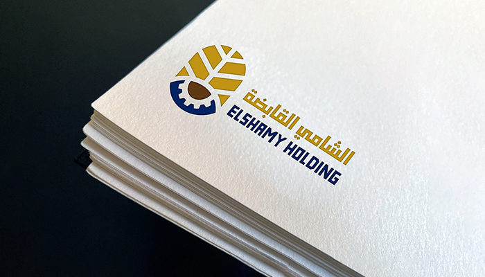
The final logo for Elshamy Holding presents a timeless, trustworthy identity that beautifully balances agricultural heritage with corporate professionalism. The primary logo features a distinctive emblematic mark that combines symbols of agriculture and legacy—likely a stylized wheat sheaf, olive branch, or ear of grain enclosed within a protective shield or circular frame. This emblem represents the company’s deep roots in farming and food production while conveying stability, protection, and enduring quality. The circular or shield shape also evokes unity, family, and wholeness—perfect for a family-owned holding company.
Alongside or beneath the emblem, the English brand name “Elshamy Holding” appears in a sophisticated serif or semi-serif typeface. The typography is carefully crafted to convey tradition, trust, and premium quality. The letterforms may feature classic proportions and subtle details that reference heritage and craftsmanship, aligning with the brand’s message of quality passed down through generations.
The Arabic version, is rendered in an elegant, professional calligraphic style that honors the cultural heritage of Egypt while maintaining excellent legibility. The flowing curves and precise proportions of the Arabic script create a sense of authenticity and regional connection. The Arabic text is balanced harmoniously with the English version, allowing the logo to function seamlessly in bilingual applications across Egypt’s government and private sectors.
The color palette features warm, earthy, and harvest-inspired tones. A deep, rich green serves as the primary brand color, representing growth, agriculture, sustainability, and the fertile lands of Egypt. This is often paired with warm gold, amber, or wheat tones that evoke harvest, quality products (flour, oil), and the golden legacy of the Elshamy and Elsherif families. Together, these colors create a warm, authentic, and trustworthy identity that speaks to both traditional values and modern quality standards. The overall composition is balanced, enduring, and deeply rooted, ensuring strong brand recognition across all applications from flour and oil packaging to corporate documents, truck fleets, and factory signage.
Logo Variations:
- Full Color Version: Primary logo featuring the emblem in rich green and gold tones for use on light backgrounds.
- Reverse (Light) Version: White version of the complete logo for application on dark or colored backgrounds such as product packaging or outdoor signage.
- Monochrome Version: Single-color dark green, gold, or black rendition suitable for one-color printing, legal documents, or faxes.
- Icon Only: Standalone emblematic mark (shield/circle with agricultural symbol) for use as a favicon, product stamp, or small-scale applications.
- Horizontal Layout: Full logo with emblem placed to the left of the bilingual text for standard usage across most corporate applications.
- Stacked Vertical Layout: Emblem centered above the bilingual or Arabic-only text for square applications such as product seals or website headers.
Start Your Journey Today!
If you need help getting started with a campaign that’s tailored to meet the needs of your company.

