
Bonanza
Bonanza Links operates as an exclusive sole mandate of major crude and petroleum products sellers, seizing opportunities in emerging markets and expanding its reach around the world. As the exclusive representative of the most reliable and solid petroleum products sellers, the company ensures constant availability and effective logistics of crude and petroleum products from the most distant corners of the globe. Bonanza Links specializes in trading a full range of petroleum products, covering global arbitrages with regional presence and expertise. The company’s well-managed logistics and focus on flexibility, reliability, and responsibility enable it to safely and responsively meet the world’s growing demand for petroleum products. To establish a commanding brand presence in this competitive global industry, this project focused on creating a bold, dynamic logo that reflects strength, global connectivity, and professional excellence.
Logo Objectives:
- Create a strong, authoritative visual identity suitable for the global petroleum trading industry.
- Incorporate a distinctive monogram or symbol that represents the brand's core identity.
- Use a bold, professional color palette that conveys reliability, energy, and global reach.
- Ensure the logo remains legible and scalable across large-scale applications such as signage, vehicle branding, shipping documents, and digital platforms.
- Establish a clear typographic hierarchy distinguishing the primary brand name from the service descriptor.
Creative Process:
The creative process for Bonanza Links began with a thorough understanding of the company’s unique position in the global petroleum trading market. As an exclusive sole mandate for major crude and petroleum products sellers, the brand needed to communicate authority, trust, and global operational capability. The design team recognized that the logo must feel solid and dependable while also conveying the dynamic, flexible nature of the company’s operations across emerging and established markets.
Early explorations focused on creating a distinctive monogram or mark that could serve as a powerful visual shorthand for the brand. The letter “B” emerged as a natural starting point, given the company name “Bonanza.” Multiple concepts were sketched, ranging from abstract geometric shapes to more literal interpretations of global trade such as arrows, compass points, or interconnected lines. The goal was to create a mark that feels both authoritative and forward-moving—reflecting the company’s ability to seize opportunities and expand reach worldwide.
The selected direction evolved around a bold, stylized “B” monogram that incorporates subtle dynamic elements—perhaps an arrow, a swoosh, or a globe segment—suggesting movement, progress, and global connectivity. This mark was designed to stand alone effectively or pair seamlessly with the full wordmark. Typography was carefully chosen to complement this bold monogram: a strong, clean sans-serif typeface for “BONANZA LINKS” that conveys professionalism and stability, paired with a smaller, equally clean typeface for the descriptor “CONSULTANCY & PROJECT MANAGEMENT.” Color exploration focused on deep, powerful blues and rich golds or oranges—colors associated with energy, petroleum, trust, and global trade. Throughout the process, particular attention was paid to the logo’s performance at various scales, from small document headers to large industrial signage.
Final Logo Design:
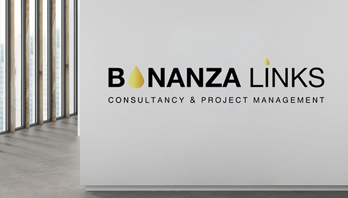
The final logo for Bonanza Links presents a bold, dynamic identity that commands attention in the global petroleum trading sector. The primary logo features a distinctive, stylized “B” monogram as its central visual element. This monogram is crafted with clean, geometric lines that convey strength and precision, while subtle dynamic elements—such as a forward-moving arrow, a swooping curve, or a globe-inspired arc—are integrated into the letterform. These details suggest global connectivity, forward momentum, and the company’s ability to seize opportunities across emerging and established markets.
Alongside or beneath the monogram, the full brand name “BONANZA LINKS” appears in a bold, uppercase sans-serif typeface. The letterforms are well-spaced and highly legible, with consistent stroke weights that convey reliability and professionalism. The word “LINKS” may be given subtle emphasis to highlight the company’s role in connecting global sellers with international buyers.
Beneath the primary brand name, the service descriptor “CONSULTANCY & PROJECT MANAGEMENT” is presented in a smaller, clean sans-serif typeface, establishing a clear visual hierarchy. This descriptor provides essential context for the brand, clarifying the company’s professional services in the petroleum trading ecosystem.
The color palette features powerful, industry-appropriate tones. A deep, trustworthy navy or royal blue serves as the primary color, conveying stability, reliability, and global reach. This is often paired with a warm gold, amber, or orange accent—colors that evoke energy, petroleum, and the valuable nature of the products being traded. This gold accent may be applied to the “B” monogram or to specific elements within the wordmark, creating a striking contrast that draws the eye. The overall composition is balanced, authoritative, and highly memorable, ensuring strong brand recognition across all applications from corporate presentations and shipping documentation to vehicle branding and large-format signage.
Logo Variations:
- Full Color Version: Primary logo featuring the bold "B" monogram and wordmark in navy blue with gold accents for use on light backgrounds.
- Reverse (Light) Version: White version of the complete logo for application on dark or photographic backgrounds such as outdoor signage or digital displays.
- Monochrome Version: Single-color dark blue or black rendition suitable for one-color printing, shipping documents, contracts, or faxes.
- Icon Only: Standalone "B" monogram for use as a favicon, mobile app icon, social media profile image, or small-scale applications.
- Horizontal Layout: Full logo with monogram placed to the left of the wordmark for standard usage across most corporate applications.
- Stacked Vertical Layout: Monogram centered above the full wordmark and descriptor for square applications such as building signage or document watermarks.
- Wordmark Only: "BONANZA LINKS" without the monogram or descriptor for informal or internal applications where the brand is already established.
Start Your Journey Today!
If you need help getting started with a campaign that’s tailored to meet the needs of your company.

